Vision & Strategy
Origin of our Brand Name and Logo

Origin of our Brand Name and Logo
A two-line design—the banner of the Information Revolution that the SoftBank Group hoists as we sail toward a new dawn

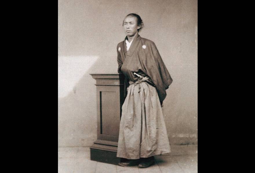
Imagine a group of visionaries who share the same Kokorozashi (Mission). They act with one mind to achieve their ideals, braving all dangers to usher in a new era in an age of upheaval. The SoftBank Group draws inspiration from one such group—the Kaientai, an enterprising shipping company founded in 1865 by the visionary Sakamoto Ryoma. Supplied with the best intelligence and possessing abundant knowledge and wisdom, the Kaientai and its founder rejected age-worn feudalistic values in favor of free thinking and bold action. In this way, they led a revolution that resulted in the modernization of Japan. Our corporate logo derives from the Kaientai’s flag. It represents our admiration for, and belief in, the Kaientai’s single-minded pursuit of their vision, which imagined a Japan 100 years in the future. The SoftBank Group is a fleet of similarly visionary crusaders. Our vessels fly the banner of the 21st-century Kaientai, symbolizing our own single-minded pursuit of a vision: Information Revolution—Happiness for everyone.
Brand name
A key source of infrastructure
for the information society
SoftBank Group Corp. started out in 1981 as a distributor of computer software. As software is called “soft” in Japanese, the name “SoftBank” literally means “a bank of software.” We chose the word “bank” based on our grand aspiration to be a key source of infrastructure for the information society.
Brand Logo
Banner of a 21st century Kaientai
The SoftBank logo comprises “double-line” and “silver” elements, along with the letters for “SoftBank”.
The brand logo of SoftBank is designed based on the
banner of the Kaientai.
-

-
When Masayoshi Son founded the Company, he had a vision.
Now, people who share that vision voyage together through turbulent waters to ensure that it comes to pass.The Kaientai too in their day had a vision for a future Japan 50 or 100 years from then and sailed boldly forward through turbulent seas, giving everything to achieve their goal. Led by Sakamoto Ryoma, they had advanced intelligence and knowledge and served as a catalyst for Japan's transformation into a modern, free-thinking, boldly decisive state, untrammeled by tribal rivalries or the conventional limits of the time. As a mark of respect for their passion and empathy with their vision, our brand symbol is designed based on the banner of the Kaientai.
-

-
Our brand symbol also represents our ardent passion to be the kind of enterprise that aims to accelerate human progress and bring happiness to all via the Information Revolution whilst continuing to grow for the next 300 years. The SoftBank Group is a ship of comrades with the banner of a 21st century Kaientai flying on its mast.
The two lines represent “=
(equal)” or “answer”
-

-
The double-line represents the “= (equal)” sign, symbolizing the SoftBank Group as a driver of the Information Revolution. It shows that the SoftBank Group has an “answer” it can provide to customers to help solve the various problems the world faces. The double-line also expresses interactive communication and unlimited possibilities.
Our brand color is shining silver
The font used is the Japanese Mincho typeface to
convey timelessness
-

-
We use the Mincho (Japanese serif) typeface for the font of our brand name representing our goal of accelerating the Information Revolution to make the world a happier place while respecting history.
